
In a world where the pen was mightier than the sword, medieval calligraphy was a formidable force. Every stroke of the quill, every curve and line, held a powerful significance. So, buckle up for a journey into this fascinating world where art and communication intertwined.
Importance of Calligraphy in Medieval Times
Ever wondered why calligraphy, specifically medieval calligraphy, held such great importance? Think of it as the Google of the Middle Ages. No, seriously! In a time when printing was yet to make its debut, calligraphy was the mainstay of written communication.
A calligrapher, with his skillful artistry, was like a web designer of yore, shaping and influencing the way information was consumed. From drafting royal decrees to replicating holy texts, the calligrapher’s quill carried the weight of information, education, religion, and power. So, it wouldn’t be an exaggeration to say that medieval calligraphy was more than an art; it was a backbone of medieval society, supporting and propagating crucial societal functions.
But that’s not all. Medieval calligraphy was also a manifestation of the era’s aesthetics, an art form that held a mirror to the societal values and cultural sensibilities. Each script style, each ornate initial, was a testament to the artistic sensibilities of the time. It’s as if the calligraphers painted the medieval times with their ink, creating a tapestry that was as informative as it was beautiful.
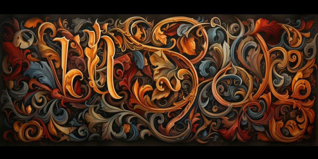
Significance of Ink Trails
Now, let’s delve into the heart of medieval calligraphy – the ink trails. At first glance, it might seem like a series of strokes, a medley of curves and lines. But in reality, each ink trail was a path to knowledge, a pathway to power, and a trail of beauty.
Each ink trail was like a piece of a puzzle, coming together to form words, sentences, paragraphs, and finally, manuscripts. And within these manuscripts lay knowledge – stories, religious texts, scientific theories, philosophical musings. Knowledge that enlightened minds, shaped societies, and influenced cultures.
But the ink trails weren’t just carriers of knowledge. They were also a demonstration of power. A beautifully calligraphed royal decree was a show of authority, a visual assertion of the monarchy’s power. The ink trails were a medium through which power was exercised, commands were issued, and influence was extended.
And then, there was the undeniable beauty of these ink trails. The aesthetic appeal of the ornate scripts, the intricate details, the play of light and shadow – it all combined to create an art form that was as pleasing to the eyes as it was to the mind. It’s as if each ink trail was a stroke of beauty, painting a world of words in the most artistic way.
So, as we journey through the realm of medieval calligraphy, let’s keep these perspectives in mind. The ink trails we encounter are not just strokes of a quill; they are trails of knowledge, power, and beauty. They are echoes of the past, insights into an era where words were art, and art was power. So, ready to follow the ink trail?
Historical Context
Before we plunge further into the intricacies of medieval calligraphy, let’s take a moment to orient ourselves within the broader medieval landscape.
Overview of the Medieval Period
The medieval period, spanning from the 5th to the 15th century, was a time of great change. With the fall of the Roman Empire marking its start, this era saw the rise of kingdoms, the spread of Christianity, the birth of Gothic art, and the harrowing experience of the Black Death.
However, despite these ups and downs, one constant remained – the power of the written word. In an era where information was scarce, and education a privilege, the written word was the beacon guiding the fortunate few. It was within this context that medieval calligraphy blossomed.
Role of Calligraphy in the Middle Ages
In the medieval period, calligraphy was a prized skill, held in high regard for its aesthetic and practical significance. It was the medium through which knowledge was preserved and disseminated, playing a crucial role in the survival and spread of ideas.
The calligraphers of the Middle Ages, often monks, were not merely artists but the scholars, scribes, and librarians of their time. They produced manuscripts, copying and translating ancient texts, preserving the wisdom of ages in their meticulously penned scrolls.
Tools and Materials
Creating a calligraphic masterpiece in the Middle Ages was no easy feat. It required not just skill and patience but also a range of tools and materials.
Types of Pens Used
The primary tool of the medieval calligrapher was the quill pen. Fashioned from bird feathers, often goose or swan, these pens were ideal for the fine, precise strokes required in medieval calligraphy. Different nibs were cut into the quill for different scripts, demonstrating the incredible diversity within the calligraphic arts.
Ink and Parchment
Next in the calligrapher’s toolbox were the ink and parchment. The ink was often a concoction of iron salts, tannin from oak galls, and gum arabic, resulting in a dark, durable ink that stood the test of time.
The parchment, made from the prepared skin of animals, was the canvas for these inked masterpieces. The smooth, durable surface of the parchment made it the ideal medium for calligraphy, although it was a luxury few could afford.
Other Materials and Equipment
Other essential equipment included the penknife, used to cut the quill and scrape off errors from the parchment, and the lead stylus, used for outlining the text before it was inked. The scribe’s desk was also a critical part of the setup, often featuring an angled surface for easier writing.
So, the art of medieval calligraphy was not just about skillful penmanship. It was also about mastering a diverse range of tools and materials, blending them into an intricate dance of ink on parchment. Now that we have our tools ready, shall we begin our calligraphic journey?
Calligraphy Styles
If medieval calligraphy were a language, then the various scripts would be its dialects. Each with a unique flavor, these scripts reflected the artistry, culture, and history of their times.
Uncial Script
Our journey through the scripts of medieval calligraphy begins with the Uncial script. Flourishing from the 4th to 8th centuries, Uncial script was characterized by rounded letters, devoid of any harsh lines or angles. With its simple, minimalist elegance, it’s no wonder this script was favored for religious texts.
Gothic Script
Fast-forward a few centuries, and we find ourselves amidst the peaks and valleys of the Gothic script. Emerging in the 12th century, this script is all about drama and contrast. Its tall, narrow letters and sharp angular lines make it the skyscraper of calligraphy scripts. Packed tightly together, like city buildings huddled close, Gothic script was the space-saver of the medieval world.
Carolingian Script
In contrast to the high drama of Gothic script, the Carolingian script was the breath of fresh air. Developed in the court of Charlemagne, it was known for its clarity and legibility. Its rounded, open letterforms were a nod to the Roman scripts, bringing back the simplicity and elegance that the Gothic script had left behind.
Lombardic Script
If the Carolingian script was the scholar, then the Lombardic script was the entertainer. With its ornate, decorative letterforms, Lombardic script was the party-goer of the medieval scripts. Used primarily for titles and initials, it added a touch of flamboyance to the otherwise sober texts.
Other Regional Variations
Just like dialects change from region to region, so too did the scripts of medieval calligraphy. From the Insular script of the British Isles to the Beneventan script of southern Italy, each region had its unique spin on calligraphy.
Techniques and Methods
From the first stroke of the quill to the final embellishment, the art of medieval calligraphy was a series of deliberate, meticulous steps.
Basic Strokes and Letterforms
Each script started with the basic strokes – the straight line, the curve, the loop. These strokes combined in various ways to form the letters. Understanding these strokes and the anatomy of the letters was the first step towards mastering medieval calligraphy.
Layout and Composition
The layout was as crucial as the lettering. It wasn’t just about what was written, but also how it was placed on the page. A well-planned layout could guide the reader’s eye, enhancing the readability and aesthetic appeal of the text.
Decorative Elements
The medieval scribe wasn’t just a writer; he was an artist. Using decorative elements like borders, initials, and line-fillers, he could transform a simple page of text into a work of art.
Illumination and Embellishment
And then came the pièce de résistance – the illumination. The application of gold leaf and bright pigments could turn a manuscript into a glowing masterpiece. The embellishments weren’t just for show; they added layers of meaning, enhancing the visual narration of the text.
So, from the first basic stroke to the final embellishment, the art of medieval calligraphy was a journey in itself. Ready to continue our adventure? Let’s follow the ink trail and see where it leads us.
Master Calligraphers
Let’s now turn our attention to the maestros of medieval calligraphy, those who held the quill that penned history.
Prominent Calligraphers of the Medieval Period
The Middle Ages saw several master calligraphers, but a few stand out for their exceptional skill and influence. Eadfrith of Lindisfarne, the reputed scribe of the Lindisfarne Gospels, is one such calligrapher. His work is celebrated for its decorative intricacy and sublime craftsmanship.
Similarly, Charlemagne’s chief advisor, Alcuin of York, played a pivotal role in developing the Carolingian script, which drastically improved the legibility of texts. This led to an intellectual revival, setting the stage for the Renaissance.
Their Contributions and Influence
These master calligraphers, and many others, left an indelible mark on the pages of history. Their contributions were not just confined to the aesthetic aspects of writing but also had far-reaching implications for the dissemination of knowledge and culture.
Calligraphy in Manuscripts
The real magic of medieval calligraphy unfolds on the parchment pages of illuminated manuscripts, where it becomes a visual symphony of text and decoration.
Role of Calligraphy in Manuscript Production
In the world of medieval manuscripts, calligraphy was king. It was the means by which ideas were immortalized and preserved for posterity. Calligraphy was more than just fancy handwriting; it was a critical component of the manuscript production process.
Each manuscript was a labor of love, often requiring months, if not years, of meticulous work. The process involved various stages – preparing the parchment, drafting the layout, writing the text, and finally illuminating the page. Every step was a work of craft and art, and calligraphy was at its heart.
Examples of Famous Illuminated Manuscripts
A prime example of the marriage of calligraphy and illumination is the Lindisfarne Gospels. This early 8th-century manuscript is a masterpiece of Hiberno-Saxon art, showcasing the pinnacle of Uncial script and intricate illumination.
Equally stunning is the Book of Kells, a 9th-century manuscript attributed to the monks of Iona. Renowned for its elaborate decoration, it is a testament to the exquisite skill of its creators. The text, written in Insular script, is a dazzling display of creativity and devotion.
Finally, the Hours of Catherine of Cleves, a 15th-century Dutch manuscript, is an exemplar of the Gothic script. Its richly illuminated pages, featuring ornate borders and miniatures, are a feast for the eyes.
So, from the masters of the quill to the parchment pages of illuminated manuscripts, medieval calligraphy tells a story that goes beyond words. It’s a story of art and history, culture, and devotion, etched in ink and illuminated in gold. Ready to turn the page and continue the journey? The trail of ink awaits!
Calligraphy in Religious Texts
The marriage of art and faith finds one of its most profound expressions in the religious texts of the Middle Ages.
Importance of Calligraphy in Religious Manuscripts
Religious manuscripts from the Middle Ages offer some of the finest examples of medieval calligraphy. Have you ever thought why? These texts, such as the Book of Kells and the Lindisfarne Gospels, were not mere books. They were sacred vessels of divine wisdom. The calligraphy used in these manuscripts was considered an act of devotion, an offering of one’s skill and creativity to honor the divine. The intricate details and the labor-intensive process elevated the task of writing to a spiritual discipline.
Religious Symbolism and Calligraphic Expression
In these holy manuscripts, calligraphy often dovetailed with religious symbolism. Letters were not just letters; they were transformed into visual sermons. For instance, the initial letters in the Book of Kells are ornately decorated, often incorporating Christian symbols like the cross or the fish. These visually stunning ‘illuminated’ letters served as a form of devotion and a means of interpreting religious narratives.
Evolution and Legacy
As we continue our journey through the parchment pages of history, let’s see how medieval calligraphy transitioned over time and its legacy in our world today.
Transition to Print and Decline of Calligraphy
The 15th century brought a seismic shift in the world of writing with the invention of the printing press by Johannes Gutenberg. With books becoming more accessible and less labor-intensive, the practice of calligraphy saw a steady decline. However, this did not signal the end of calligraphy. Instead, it morphed and adapted, leaving an indelible mark on the typography used in printed books.
Revival of Interest in Calligraphy in Modern Times
Isn’t it interesting how old-world charm often makes a comeback? Calligraphy, too, has seen a revival in modern times. It is no longer a relic of the past but a vibrant art form. From invitations to logo designs, calligraphy has made a strong resurgence, offering a touch of elegance and personalization in our digitized world.
Contemporary Calligraphic Practices and Artists
Many contemporary artists continue to be enchanted by the charm of medieval calligraphy and adapt it in their work. Artists like Sheila Waters and John Stevens have kept the tradition alive, creating works that resonate with the timeless beauty of medieval scripts while adding a contemporary touch.
So, what’s the takeaway from this journey through the world of medieval calligraphy? It’s that calligraphy, far from being just beautiful writing, is a visual testament to our cultural heritage. It is an art form that connects us with our past, enriches our present, and continues to evolve into the future. Whether you’re a history buff, a lover of art, or someone who appreciates the power of the written word, understanding medieval calligraphy offers an enlightening perspective. And who knows, you might just be inspired to pick up a quill and create your own piece of history!
Conclusion
We’ve reached the end of our journey through the fascinating world of medieval calligraphy. It’s been a ride full of awe-inspiring artistry and historical insights, hasn’t it?
Recap of the Beauty and Significance of Medieval Calligraphy
Let’s rewind a bit and appreciate the panorama we’ve surveyed. From the delicate strokes of the uncial script to the rich flourishes of the gothic script, we’ve traced the artful ink trails of medieval calligraphy, illuminating the corners of history that usually remain in shadows. We’ve admired the work of master calligraphers who painstakingly created illuminated manuscripts, imbuing every letter with a soul and a purpose.
We’ve witnessed the powerful marriage of art and faith in religious texts, where calligraphy was a form of divine worship. Furthermore, we’ve recognized the intricate tools and materials that were at the heart of this mesmerizing art form, from the carefully crafted pens to the resilient parchment.
Indeed, it’s hard to think of medieval calligraphy as just a form of writing, isn’t it? It’s like a dance of ink on parchment, a symphony of shapes and strokes that communicates far beyond the literal meaning of words.
Importance of Preserving and Appreciating This Art Form
Just because medieval calligraphy is from the past doesn’t mean it should remain there, preserved in time like a fossil. Instead, it should be a living, breathing part of our cultural consciousness. After all, calligraphy is more than an art; it’s a connection to our roots, an embodiment of our history, and a testament to human creativity and resilience.
In a world increasingly dominated by digital technology and typed text, taking the time to appreciate the art of medieval calligraphy can provide a refreshing perspective. It can remind us of the beauty of handmade art and the power of patience and precision. And who knows? You might even feel inspired to pick up a quill yourself and feel the joy of creating something beautiful with your own hands.
In the end, appreciating medieval calligraphy is about more than just appreciating beautiful writing. It’s about recognizing our shared cultural heritage and the timeless human capacity for creativity. It’s about slowing down and savoring the beauty in the details. And most importantly, it’s about keeping this art form alive, not just in museums and history books, but in our hearts and minds.
And that, dear reader, is the real beauty and significance of medieval calligraphy. Let’s continue to admire it, preserve it, and above all, let’s continue to tell its story, one beautiful letter at a time.